Geocoding and Mapping Data With IBM Db2 Web Query for i
Have you ever wanted to apply mapping technology to your data? Ever since Google and Apple Maps became popular, other vendors have used this same mapping technology to provide a basis for business intelligence data analysis.
Several towns in my rural area have begun investigating how to improve internet access and have asked vendors to bid on high-speed Internet services in the form or cable or fiber broadband. In relation to my town, one of the vendors replied with a list of addresses in the area, indicating whether each address was served or not served by high-speed services as seen in Figure 1.
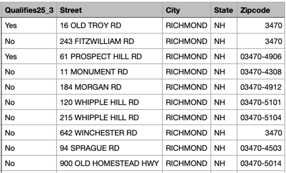
Column 1 shows Yes or No to indicate whether the address can support the current government definition of high-speed, a 25MB downlink and 3 MB uplink. There’s debate about whether this is fast enough for remote learning or work-from-home tasks, but I’ll let somebody else write about that. With my addresses in a spreadsheet, I decided to take a fling at geocoding this data to create a map.
One of the interesting features of IBM Db2 Web Query for i (Express Edition or any other edition) is the ability to select a mapping background for an area and plot points on a map. The Web Query product includes maps of the World, United States and various states and provinces. In order to utilize such maps, you use parameters in a variety of data types, including zip code, city, country, state. However, to be really specific, you can use latitude and longitude, or what’s called a geographic data point. This quickly gets you into the business of geocoding.
I was under the impression that there were lots of places on the web where I could upload my address list and get back the latitude and longitude values for free! This turned out not to be the case. I would go to a site and specify an address, but then, to convert data, sites often wanted me to create an account and pay. I eventually found the US Census website offers a conversion capability for free.
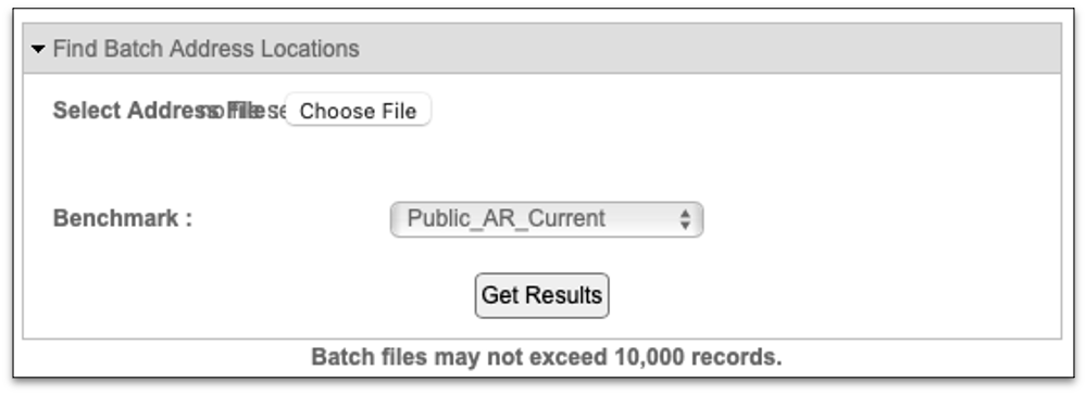
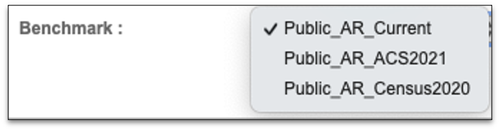
I could either enter a single address or a batch. My list of addresses had about 600 entries, so batch was the way to go. A batch was processed by a web form like Figure 2, allowing me to pick the file from my desktop and also specify which census record option to be used, seen in Figure 3.
I selected my list, formatted like Figure 1, pressed the button and waited. After a bit, it failed. The problem was that my addresses had the parts of the address in separate fields such as street number, street, city, state and zip code as opposed to simply address. I merged those fields together and gave it another try. The result was downloaded and when I opened it, I saw data as depicted in Figure 4.
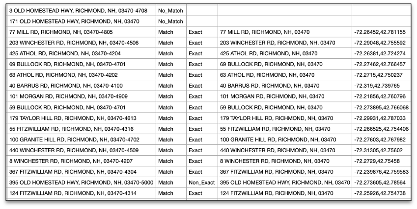
This attempt looked better but had some mis-matched data because some of my addresses had zip code as five digits and some had zip-plus-four format (nnnnn-nnnn). I stripped off the dash and extra four digits so all the records had the five-digit value. This time, I got back a few more results. The census software download contains the original address, an indicator field for Match or No_Match, whether the match was Exact or Non_Exact and finally, the most interesting data, the comma-separated latitude and longitude pair, that correspond to the associated address.
I still had a number of No_Match items in the results. I suspect this was because of either new home construction in the area or errors during the census data gathering. For example, my own address was listed as a Non-Exact Match but the address data looked correct and the result still contained a latitude and longitude. I don’t recall anyone questioning us about the 2020 census, but we did complete a document that came in the mail.
I had geocoded 90% of my addresses so I uploaded the data to my IBM i server and looked at the data with Web Query. I was able to quickly plot the points I had derived, to obtain the map shown in Figure 5.
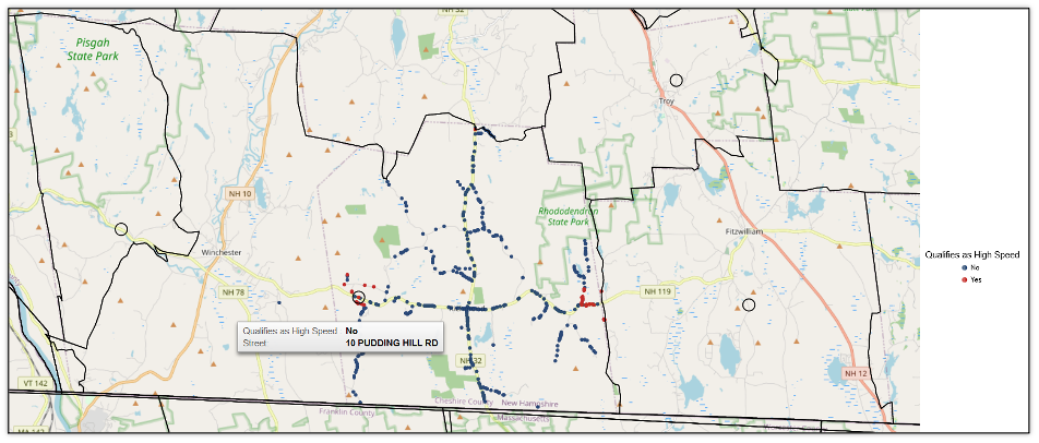
This map clearly shows that addresses are predominantly a NO as relatively few addresses qualify as high-speed capable: Yes = Red dot vs. No = Blue dot.
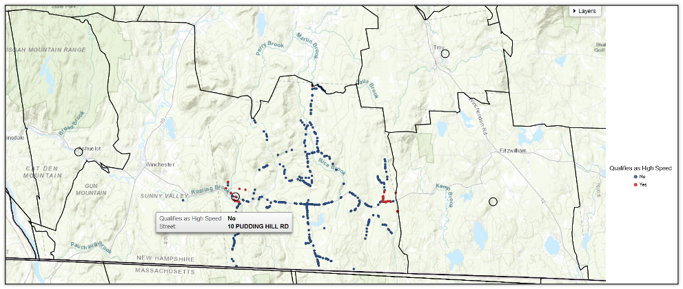
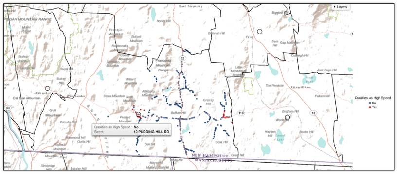
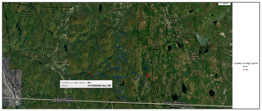
Like Google maps, WQ enables you to select varieties of background choices at the time you create the map. Backgrounds include several Street Name maps (Figure 5), Topographic (Figure 6), Terrain (Figure 7), and some satellite imagery options (Figure 8), depending upon what seems important to your subject matter.
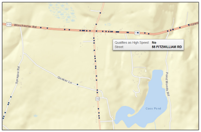
Of course, a user could zoom in and out on any of these maps to review data more closely as in Figure 9 showing the “downtown” intersection and surrounding streets.
In my broadband mapping, I was seeking to provide only a single point (dot) for each address with the YES or NO information.
Continuing with this example, if I wished to map the number of customers with and without access on a given street, I could summarize the count of addresses per street and perhaps plot the count as a SIZE value on my map, to depict density for each street. The data to support such a map is shown in Figure 10.
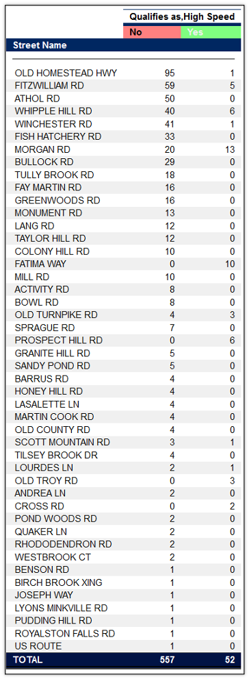
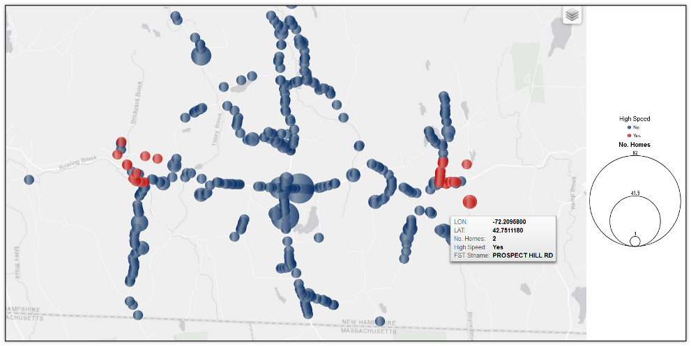
Applying the above Figure 10 data to the map, I was able to create a plot which depicts density of occurrences for the haves and have-nots using a bubble or dot sized by the count on the geographic area map (see Figure 11). As I hover over a larger Red (Yes) bubble, I can see a pop-up for the number of high-speed qualified address locations on that street.
For many business intelligence applications, it could be beneficial to associate a value with the map location. For example, to plot the values in a geography as total sales, total orders or some such other value, you can use a country, state or city or zip code as the data point.
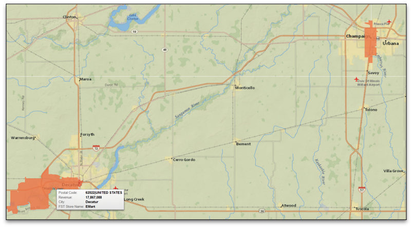
In the following example, seen in Figure 12, data has been plotted for store revenue by zip code across the US. Looking at the central area of the US, we can see some orange/red markers on the map, which correspond to the magnitude of the revenue values in various zip code locations. Interestingly, unlike my geocoded dot example, the zip code map colors the entire area. Thus if you had complete zip code data for a state, you could quickly colorize by values for each.
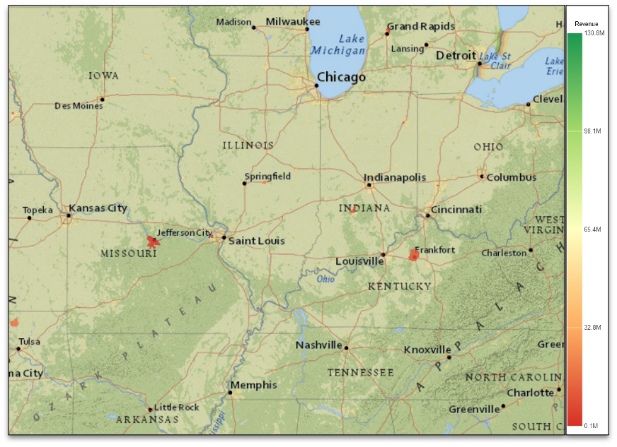
Zooming in on this map, causes areas to become more apparent and the geography to become more clear as we get “closer to the ground” as shown in Figure 13.
Geocoding and mapping can be a powerful technique to derive new insights from address-based data. IBM Db2 Web Query for i is positioned to help you gain these insights with several map types, flexible backgrounds and geographic plotting capabilities.
By including visual data cues like maps in conjunction with text and charts in dashboards, you give users and business analysts a number of ways to better grasp critical company information.