Using Stored Procedures in DB2 Web Query for i: Part 2
A stored procedure with multiple result sets can be created in a dashboard using DB2 Web Query for i. Learn how to do more with more complex SQL.
The first installment in this two-part series demonstrates how a stored procedure with multiple result sets can be created―and how data is consumed―in a dashboard using DB2 Web Query for i. (Read part 1 here.)
To review, a dashboard is a document containing several pieces of related information, typically from reports and charts. In part one, the content consists of hypothetical sales-related information for Stores, Plants and Sales Reps, depicting top performers from each category. It’s retrieved from DB2 by a stored procedure with multiple result sets, both for convenience and speed.
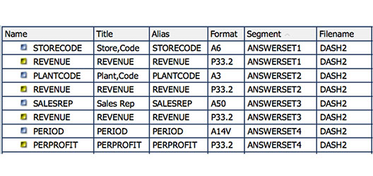
The SQL used in the stored procedure limits the number of rows of summarized data that are returned, sorting the data to report the top 10 items in each category by descending revenue amount. Four groups of data are returned in their respective SQL result sets, and Web Query shows them in the data pane as ANWERSET1, 2, 3 and 4. These ANSWERSETs are seen in Figure 1 below.
Part one omits the fourth result (see Figure 2 below) produced by the stored procedure, which was generated by the C4 cursor, because it differs from the first three. Let’s examine those differences.

Doing More with More Complex SQL
The C4 DECLARE statement utilizes a slightly more complex SQL statement to accomplish several things. It:
- establishes time buckets by extracting year and month from the order date,
- calculates revenue and cost amounts,
- combines year/month,
- summarizes profit as revenue-cost, by year and month; and,
- using sorting and fetching in SQL, the statement returns the 12 most recent periods.
What this yields is a result set with two fields from which we can present a chart to show profit by period, or over time. You can see that ANSWERSET4 contains the Period and the summarized Profit dollars for the period. As time passes and additional records are added to the database, they will be detected when the SQL runs. This sort of rolling-month presentation is useful to show the most recent activity without the need to pass parameters to filter the date selection. It also frees the report creator from maintaining logic for checking date range information.
As a side note, although I used SQL to extract the year and month from a database date field, Web Query offers both metadata and built-in functions as additional ways to decompose dates, times or timestamps into constituent parts when these fields are needed in a report.
The Web Query InfoAssist designer features many possible chart types. To chart profit over time, one approach is to utilize a line chart. In the line chart, plotting is accomplished by placing profit dollars on the Y-axis and time values on the X-axis, as shown in Figure 3 below. This is a simple presentation that uses a single data group of X-axis values. Web Query could chart more than one group if, for example, we need to show a comparison between several data groups over the same time span, with multiple lines. We can also create a multiple Y-axis chart to present two different data sets with differing scales (left and right), where each axis has a different range (e.g., plotting numeric amounts to contrast quantity good versus quantity scrap manufactured over a period of time).

A completed dashboard document consisting of seven different reports is seen in Figure 4 below. (It’s also included at the end of part one.) That document was created with HTML chosen as type of output.

An HTML page can be viewed on any platform that has a browser. It can also be viewed on a mobile (tablet or phone) device using the Information Builders Mobile Faves app, (a free download from the iOS or Android app stores). Mobile Faves implements platform-specific rendering of Web Query reports. So, for example, a savvy iPad user could view content from BI reporting with a minimal learning curve.
Using an HTML document type for a dashboard provides fast loading―maybe the fastest possible. Of course performance is a priority whenever you’re building dashboards. Everybody wants rapid response time, and your management likely demands it. Web Query and DB2, working together, offer the tools to help you create exciting applications with excellent performance characteristics.
In the sample dashboard document, each result uses the Top-N type of SQL retrieval. So even though several cursors are open, providing data for several rendered reports, the response is rapid because a relatively small number of records are returned. The Top-N approach is appealing for dashboards when one wishes to convey goal attainment. If we wanted to identify the poorest performers, Bottom-N could be depicted by sorting in reverse sequence.
Several other options are available for Web Query output, including PDF, PowerPoint and Active Report. PDF or PowerPoint might be appropriate for reports that are being emailed to stake-holders outside the company. They could open the resulting file without any knowledge of DB2 Web Query’s role in the report creation.
The Active Report type offers a number of impressive interactive features. Figure 5 (see below) displays an enhanced dashboard with the Active Report setting selected, along with some additional features.

Document dashboards created using the Active Report output type can behave a little differently than their HTML counterparts. For example, as you roll the cursor over the individual charts, they can provide interactions, such as pop-up bubbles at axis intersections, highlights on pie slices or bars, or row highlights in reports (see Figure 6 below).

Web Query provides settings to add row or column totals or to enable visualization bars to graphically depict the numeric magnitude of rows in a report. In addition, Active Report allows recipients to perform calculation for totals, filter certain records in/out, summarize one column while grouping by another, add percentages, and perform sorting, subtotaling and charting tasks.
Changing the Look
With reporting―specifically, dashboard reporting―data is obviously the primary consideration. However, the visual part of the presentation is also important. Web Query’s array of customization tools allow you to change colors, themes, styles or fonts, and specify whether the document contains a single page or multiple pages. With the style settings, you can change the appearance of specific columns as well as the attributes of the headings and data. Or you can use the built-in themes to apply variations of color, font and report look-and-feel to the entire report. Documents can contain text and images (like company logos), along with the themes and styles. By setting Web Query values to mimic your corporate color scheme, you can create vibrant reporting venues that coincide with other web application designs.
For some applications, a single report or static presentation isn’t enough, so Web Query allows you to configure links within report or chart columns to enable users to go from one report to other relevant information. With OLAP or Active Report capabilities, end users can drill-down, sort, summarize or chart data to gain additional insights into corporate performance. With the proper security settings, you can allow comments to be added to reports or report data to be exported for spreadsheet analysis or even e-mailed to colleagues.
Web Query can easily handle so many things that we previously had to program ourselves―including some things that Query/400 was never capable of. It’s an invaluable to tool that allows users and corporate decision-makers to obtain insights from their data and make better informed decisions. Hopefully this series demonstrates that DB2 Web Query for i and stored procedures are a powerful combination for writing reports once and running them anywhere with improved data presentation.