Creating Dashboards Using a Replacement Option for Db2 Web Query
IBM i consultant Rick Flagler outlines the steps necessary to develop a dashboard using the MRC product, which he champions as filling the void of IBM's withdrawn platform

Probably all readers are familiar with their vehicle’s dashboard, which contains a number of metrics associated with operational performance. A speedometer is the most important, often depicted with either a needle or digitally. This metric is closely followed by fuel level or range remaining, plus temperature and lighting status.
Dashboards developed in the IT community can be used to present metrics for a topic or category. Such metrics, referred to as key performance indicators (KPIs), depict data for a known period which could be daily, monthly, quarterly or annually. For example, you might develop an IT dashboard showing server performance, disk capacity or number of active user jobs in real-time or historically. In fact, IBM i systems provide a number of Db2 services to access this type of server related information easily via SQL.
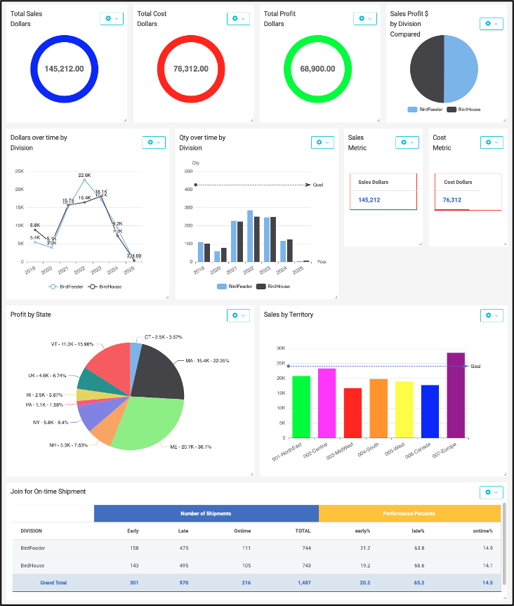
A sales dashboard, on the other hand, might present period-to-date information about shipments, order backlog, delivery performance, profitability, sales quota attainment or other sales related information. Below, in Figure 1 is a rendering of an example sales dashboard.
In a previous article, I discussed the withdrawal of IBM’s Db2 Web Query for i (WQ). The MRC m-Power software product fills that void by providing similar capabilities. In fact, clients, I’ve worked with have been able to replace the Web Query software with m-Power, using existing, unmodified Db2 and SQL objects to generate web reports with a nearly identical look and feel.
MRC’s m-Power enables you to establish a connection to the server and select database tables or views to provide data while building web-based applications. The applications can be reports, data inquiry, data maintenance, workflow or dashboards. This article will focus on dashboards and m-Power’s capabilities to convey business metrics to users. While my platform of choice is IBM i on Power Systems with Db2, you should understand that the MRC m-Power product can also be utilized with other databases and servers.
The Steps Before a Dashboard
Most businesses have applications with database tables developed over time or utilize a vendor ERP system containing many tables. Within these tables are facts that can be used to present metrics. A business may or may not have clearly articulated metrics and KPIs, or could be working to determine which metrics are most important.
Prior to taking any technical development step, clear KPI definitions are essential. An individual KPI definition will include a measurement that is strategic for the business, describe how it will be measured, what attainment (goals) looks like and how it will be presented in real-time and/or over a longer term. Such KPIs will enable a business to track, measure, evaluate and take actions to improve ongoing performance.
A dashboard is usually made up of multiple KPIs, often presented in squares on a page with a chart, graph or report inside each square to represent each metric. A developer faces the following choices:
- Where to get the data
- How to organize or summarize
- How to configure the presentation content for each metric.
Figure 1 showed a few examples of chart types rendered with m-Power. Businesses often start with metric presentations manually developed in Excel or other PC-based tools, and graduate to web pages presenting data pulled automatically from the database and summarized for easy review. Having metrics automated yields less risk of confusion and promotes a “single version of the truth.”
Let’s consider a metric for on-time delivery (OTD). It could be defined as a measure of whether products are being shipped to the customer when originally promised. To measure this, we’d have to know the customer’s desired date to get the product as well as the ship date when product actually left the building. Also, in some cases, we would need to know whether carrier transit time to the customer’s receiving/mailing address is to be included or not. Keeping it simple, let’s eliminate carriers or the postal service from the picture. We can define an equation to calculate the number of days, ie. performance, for each individual shipment:
DAYS = INVOICED_SHIP_DATE - PROMISED_DELIVERY_DATE
The SQL to calculate the number of days between promised and actual ship date might look like this:
select days(Invoice_ship_date) - days(Promise_date) as DAYSEARLYLATE from SalesData
If the result value in DAYSEARLYLATE is a negative number of days, it means the shipment was early, while a positive result means late. Exactly on-time would be zero. However, it is more typical to have a grace period between EARLY and LATE to represent OTD. This might be stated as values of -1, zero or +1 days being considered ONTIME and everything else is either EARLY or LATE. Once each shipment transaction has been assigned this number-of-days value, we can count the number of occurrences falling in each category, calling them EARLY, ONTIME, LATE and TOTAL. Then we can determine the percentage of each category during the measurement period by division.
ONTIME% = (ONTIME / TOTAL) * 100
EARLY% = (EARLY / TOTAL) * 100
LATE% = (LATE / TOTAL) * 100
The Report Options
In the IBM i and Db2 environment, a developer can easily create Db2 views over tables to summarize required data. These objects can be made known to m-Power and processed by either reports or charts.
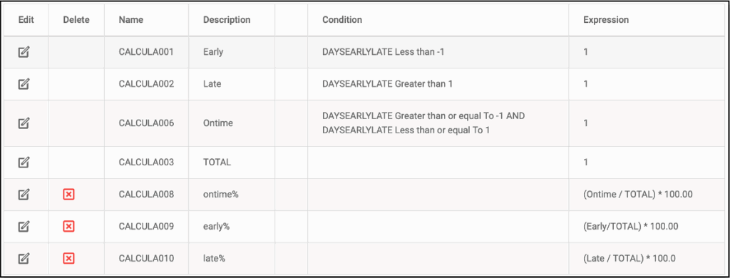
By reading a table containing the number of days for our OTD metric, m-Power could perform calculations to determine the three delivery categories, summarize the count for the number of occurrences in each category and calculate performance percentages of the total. See an example of these m-Power calculations in Figure 2.
For tables that will be used to run a variety of different reports, you can create a model in m-Power, then create reports or charts over that model. An appealing aspect of a model is that a developer can pre-join tables, create filters or selections and perform calculations within the model for subsequent reports. Mis-joins are often cited as a risk to data accuracy. Therefore, a model could reduce risk because users need not have knowledge about the join logic, rather simply use the properly joined model. The model also saves IT effort when different reports will utilize the same data set. Once a model is created, it can be selected as the data source for subsequent reports or charts.
One alternative to reading operational tables and calculating metrics each time a dashboard is displayed is to create a metric database which contains harvested values. This database could be populated by jobs extracting data for a specific reporting period, saving the values. The metric “points” could be stored with timestamp information, over time proving comparison data as well as current period values. The approach may also improve performance, because the dashboard objects could read fewer records to present the charts or graphs. This is a potential topic for a future article, discussing a design of a metric database and the possible performance improvements.
The Dashboard Options
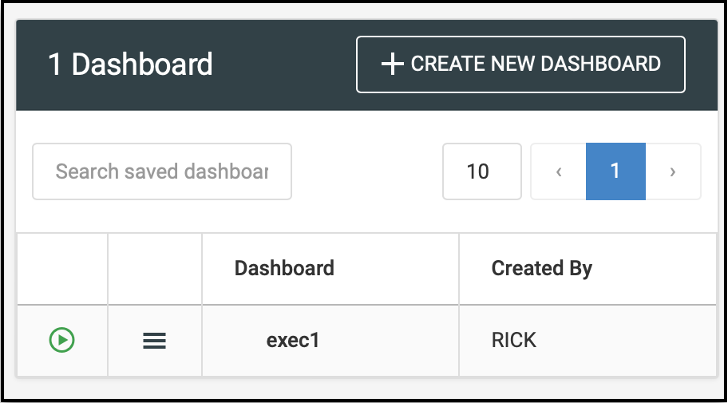
Once KPI definitions are established and tables or models are built, you can utilize the Explorer option in
m-Power to create new dashboards. When you press the CREATE NEW DASHBOARD button in Figure 3, the m-Power system presents a screen where you can name and describe your dashboard.
After you enter a name and description, you will decide whether all users or only the current user will be allowed to view the dashboard, checking Public for all as shown in Figure 4.
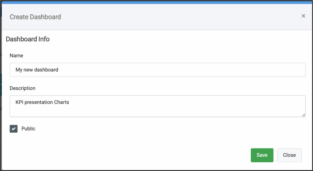
Figure 4. Naming your new dashboard.
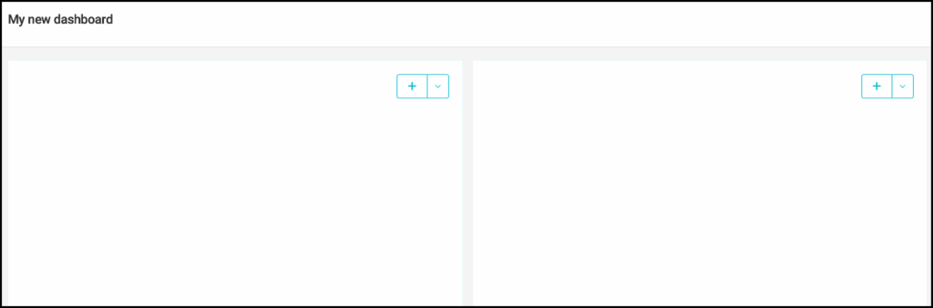
After pressing Save, you’ll see a blank dashboard (Figure 5) with a few empty squares. Each square will contain a result. You can press the plus sign (+) or down (v) symbol to add/remove content in each square. For each square on a dashboard, you can choose whether it will contain a report or a chart. You’ll then pick a report or configure a chart to reflect the KPI measure.
The m-Power product offers an array of chart types as shown in Figure 6. Each of these types has configuration and customization parameters used to control plotting the chart.

Given an existing table containing the calculated values for our OTD metric, we can use a GAUGE chart to present a single value having the overall percentage of transactions that are ONTIME. The chart settings seen in Figure 7 identify the chart type (Gauge), the field to plot (ontime%) and the range breakdown of values for the metric. The range has been configured to show that RED = 0-40% is poor performance, YELLOW = 41-70% is marginal and GREEN = 71-100% is good. The range is set using color or hex values.
Looking at the resulting gauge, company management could quickly see the overall delivery performance in the reporting period in the finished gauge. A likely enhancement would be a companion report to facilitate drilling into details of the WHY behind this attainment figure.

In a situation where performance by a grouping such as product family is desired, a bar chart can be used to contrast performances between groups. Figure 8 depicts this case, for two product families. And of course m-Power can do either column or bar charts.

A final example using the Spline chart, depicts delivery performance history over time showing the ONTIME percentage value for each year. The chart is fed using a report built over the sales model. Transaction counts are summarized by year of shipment. Both the total number of transactions and those that are ONTIME are calculated as a percentage. Then, in Figure 9, the percent is plotted by year, and the goal of 70% is also plotted.

In this article we’ve discussed dashboards and concepts surrounding KPI formulation, metrics, definition and how the MRC m-Power product provides users the ability to make dashboards and charts. Dashboards can provide a clear set of messages to readers about status of whatever is important to business progress.